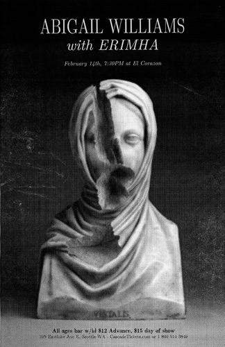
Worked on this poster for the better part of the weekend, but haven’t quite figured out what the finished version should look like.
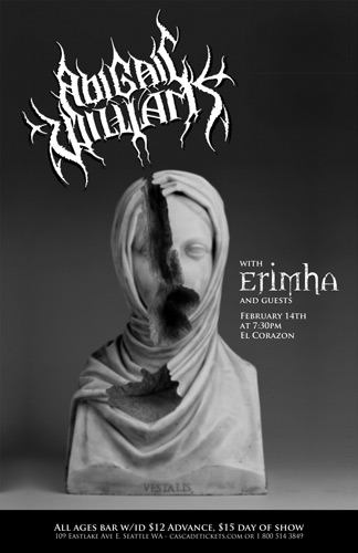
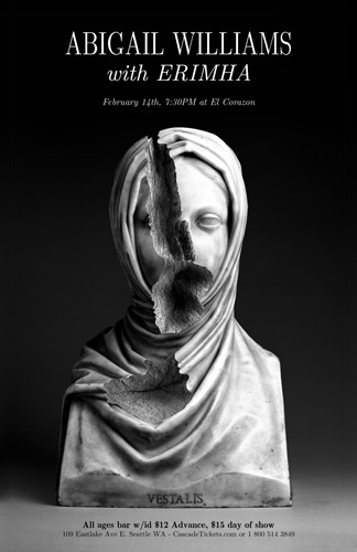
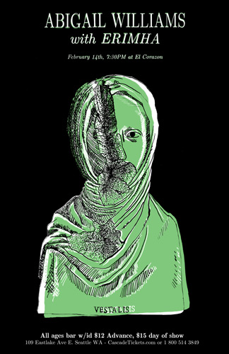
I wanted the poster to feature a broken sculpture, and so I put one together using Photoshop and a bust from the Getty collection. My first draft was basically just that photo with the band’s logos plastered onto it; but it didn’t look very compelling. For draft number two, I punched up the photo and put a bit more effort into the typography. I think this one looks good, but I’m worried the bands wouldn’t think it looks “metal” enough. The third option here uses a drawing made from my photo, but I think it looks even less metal than the second one. I mean they’ve definitely got an image, take a look at their album covers.


So the whole thing is probably gonna be scrapped, but maybe I can use parts of it in another project.
UPDATE: Maybe it’s better after being printed, roughed up, and rescanned…?
